Showing posts with label consistency. Show all posts

Tuesday, 7 August 2018

Critical contextualization of my WIP - looking for style part 1: an unexpected discovery

Throughout the module it turned out that my biggest problem was not scope (unlike module 2) but style. How to create a style of my own that is different from the cookbook stock images I am used to creating. Honestly speaking, that proved to be a tough call and greatly hampered my work. To experiment (because that seemed the obvious route) one needs to be brave and step out of their comfort zone. However, I am not exactly the brave type of person and tend to love my comfort zone so the first thing I needed to do was some research. 

Most of the food stylists I was familiar with did more conventional style photography showing food as it was and I will write more about them since some of them had quite the influence on my earlier works - in a different post. I was in need of a different approach so tutors and colleagues turned out to be of great assistance. 

One of the first people I was refereed to turned out to be a Bulgarian. What makes the whole picture even funnier was that I hadn't heard her name (which is strange since I thought I knew at least by name all prominent Bulgarian photographers). But I knew nothing about that woman, Eugenia Maximova or her project, entitled Kitchen stories.

This sounded like a fascinating start since she, too, focused on the Balkans, just like mine. Here is what she said for an interview for Lensculture, describing why she started the project:

'The people of the Balkans live in the shadow of a long history of wars, conflicts and unresolved ethnic tensions. Much of the energy that could have gone into building a future has been squandered on maintaining those tensions and the result is an impoverished present.

Young families must either pay exorbitant rents or live packed like sardines in their parents apartments. And most of those apartments are in the hopelessly ugly, crumbling concrete blocks which are the legacy of the communist era.

The term Balkan whether it is describing a culture or a geographic area, usually has a strong suggestion of the rural with a heavy overlay of the Orient. In whatever context it is used, the word reverberates with cultural and sociological connotations, with a sense of division and disagreement.

When I set out to tell a story about the Balkans, it was food that sprang to mind as being the only thing people in the whole region agree that they have in common. After five centuries of Ottoman occupation we have all continued to eat the dishes they brought.

Thinking about this shared culinary heritage, I began to wonder what was happening in Balkan kitchens these days. The kitchen is a multipurpose room, a space which reflects identity and self-perception. It embodies the spirit of the Balkan home and mirrors society as a whole.

People in the Balkans would rather spend what little money they have in a cafe than on interior decoration. The functional, unadorned style which results from this conveys a tangible sense of the region’s lost identity, the inevitable legacy of half a millennium under the Ottoman yoke and half a century behind the Iron Curtain.'

So, she decided to use the kitchen space as a metaphor and means of expressing the way people on the Balkans live today. In Bulgaria and most of the other Balkan countries, the kitchen is the heart of the home - where most of the family life goes. The living room is reserved for special occasions or guests so most of the time people gather, do their daily tasks and even have their meals in the kitchen. Actually, I am writing this on the kitchen table as this is the room in which I do most of my work.

A house without the smell of freshly cooked food is considered ill-kept and 'dead' and a woman who cannot make a simple dish is deemed 'not good' to put it very mildly. Kitchens are usually the pride and joy of any wife, the 'feminine' corner of the house which is decorated and adorned. Sometimes, it is just out of the need to restructure the space but sometimes it is driven by the need to 'show off' to the neighbours. Still, the kitchen space is of pivotal importance to any Balkan home and Maximova does have a valid point that the state of the kitchen usually tells a lot about what is the general condition of the family and the space they inhabit.

What Maximova did was travel around Bulgaria and document the interior of the houses she visited focusing on how the interior functions as an augmented whole to create an overall impression. In her works, however, she focused much more on interior (what is IN the kitchen space and how it is actually used or how it functions together with the rest of the other tools to form a whole set of symbols) than on the actual food being cooked. 

Her images look like they have been taken out of a memory book with candid interior images of the home. They are surreal at times, the whole impression being almost dream-like and thus transporting the reader back to a time long-gone when all that mattered was to be allowed to get out and play in the yard or to get that longed-for waffle or bar of chocolate. 

Fig.1 - Eugenia Maximova - Interior from Kremikovtsi, Bulgaria 
To viewers that are part of this culture, these images evoke a certain sense of nostalgia. Not because the 1990s (in my case) were a wonderful time to be in Bulgaria (or any country on the Balkans) but simply because one tends to idealize all childhood memories, even the most mundane ones. 

I can heavily relate to all images I decided to post here - because they look as if they have been taken years ago at my own house. My mother used to have those ceramic spice jars (fig.1 above) which she inherited from my great-grandmother and they are still somewhere at the back of the spice drawer (and yes, we have a whole section full of different spices). The singer on the poster used to be a chalga star when I was a teenager and most of my classmates would adore her. 

Fig.2 - Eugenia Maximova - Interior from Gorno Drjanovo, Bulgaria 
 The image above (fig.2) also projects a vivid image from my childhood (and not only). That type of salami is one of the most popular breakfast 'dishes' in Bulgaria since during the Communist times it was presumed the best quality salami. Made out of raw dried meat, it is quite tasty and most Bulgarians would eat it with anything (I do, at least, even with pancakes). When I was a child this salami was a mark of prosperity (if you can put it on your table). The jar is actually full of yogurt - on the Balkans when we use the word 'yogurt' we mean something that is not sweet. When I was a child, my mother would make yogurt herself in jars like this - that was before the era of supermarkets and packed goods. So this is like a snapshot of my childhood life. 

The next image (fig.3) I saw literally shook me because it is so alike my grandmother's kitchen. As if I am a child again and can smell the chilly peppers she used to bake (an still does) on the hot plates. 

Fig.3 - Eugenia Maximova - Interior from Kostenez, Bulgaria 

This type of stove is called Rahovets and it marked a whole era during the Communist period. It is a local brand, probably sold only on the Balkans, and (according to my whole family) the best brand ever. My mother used to cook on the exact same model up till a few years ago and that machine worked for more than 20 years. 

The icon on the next image (fig4) is also a common sight in Bulgarian kitchens, especially if the place is inhabited by older people. 


Fig.4 - Eugenia Maximova - Interior from Ruse, Bulgaria 
The last image I selected (fig.5) struck me the most since we had absolutely the same tablecloth at home and that sight - of a table covered in this print and the jars and bottles transported me around 20 years back in time. I must have been six or seven when my mother took me to an open air market to buy a new tablecloth and I picked this one because of the animals. Then, for years on end I would stare at the pictures and imagine what it would be like to be in a fairytale wood surrounded by all those beautiful animals. I even tried to draw the animals printed on the cloth. 
Fig.5 - Eugenia Maximova - Interior from Kremikovtsi, Bulgaria 
What I love about Maximova's work is that she does manage to incorporate the cultural environment into her images. These interior shots look almost like still life images or abstracts but to me (and to many more Balkan viewers, I guess) they are not still life compositions but fragments of real life. Looking at her images, I do think that I can make some use of the props she depicts - like jars, spoons etc . - in my own images to add in some local flavour. I would really like to be able to transport the viewer into a different time and evoke as strong feelings as she does. 

Her images, however, are focused on the living quarters rather than the food itself so apart from that, even though her style is quite interesting, I cannot put into practice more of it and apply it to my own work. 

My biggest problem with her project is much more ideologically oriented - or in other words, related to the message she tries to send out to the world, especially to viewers that are out of this culture and are totally unfamiliar with its specifics. 

What I dislike about the whole project is the one sided view of the Balkans as backward and torn apart. As Maximova herself stated in the interview, her idea was to show the 'lost identity' as she puts it of the Balkan people. Being at the crossroads of Europe, the Balkan people have met with a pot of other invaders through the centuries but this doesn't mean they have lost themselves and their rituals in the process. On the contrary, I believe that a new identity was forged - something that combines bits and pieces from all peoples that mingled on the territory. That makes the people on the Balkans unique, not backward or lost. 

Hence her one-sided attitude and deliberate selection of old and withered kitchens really annoys me. As if she aimed at depicting Bulgaria as the poor neighbour that has been robbed and now crumbles. The nostalgia these images evoke for me will be turned into either dismay or disgust in the eyes of a Westerner. The author herself has studied and now lives in Vienna ever since her late teens - quite a stark difference from what it is like to live in Eastern Europe - so I guess that the attempt was totally deliberate as some ex-pats tend to forget where they come from and hence tend to regard everything related to their home country as 'backward' and 'falling apart'. 

I totally wouldn't blame the Iron Curtain or the Ottoman rule for the state of those places. These are just rural areas (all the places cited are actually villages or small towns) inhabited mostly by elderly people so that they see no reason to buy new appliances or lack the funds to do so. That is why the interior gradually deteriorates - the peeling paint and the withered prove it. But such a generalization is far-fetched, to say the least. 

So, as beautiful and thought-provoking her images are, I will be incorporating little of her style and idea into my works as my aim it at the opposite end of the spectrum. 

Sources:

Eugenia Maximova's website - Kitchen stories
https://www.emaxphotography.com/kitchen-stories-from-the-balkans
https://www.lensculture.com/articles/eugenia-maximova-kitchen-stories-from-the-balkans

List of figures: 

Figure 1 – MAXIMOVA, Eugenia - Interior from Kremikovtsi, Bulgaria, 2010
Available at: https://www.emaxphotography.com/kitchen-stories-from-the-balkans
[accessed 08 August  2018]
Figure 2 – MAXIMOVA, Eugenia - Interior from Gorno Drjanovo, Bulgaria, 2010
Available at: https://www.emaxphotography.com/kitchen-stories-from-the-balkans
[accessed 08 August  2018]

Figure 3 – MAXIMOVA, Eugenia - Interior from Kostenez, Bulgaria, 2010
Available at: https://www.emaxphotography.com/kitchen-stories-from-the-balkans
[accessed 08 August  2018]

Figure 3 – MAXIMOVA, Eugenia - Interior from Ruse, Bulgaria, 2010
Available at: https://www.emaxphotography.com/kitchen-stories-from-the-balkans
[accessed 08 August  2018]

Figure 5 – MAXIMOVA, Eugenia - Interior from Kremikovtsi, Bulgaria, 2010
Available at: https://www.emaxphotography.com/kitchen-stories-from-the-balkans
[accessed 08 August  2018]

Monday, 23 April 2018

Project development - night VS day

One of the biggest challenges during this module turned out to be the selection of a suitable time for shooting. My initial idea was to take night shots only and the location allowed it. I live in Sofia so getting to the city center at almost any time of the day is not a problem. 

However, the blue hour turned out to be too short for me to tour all locations so I had to change plans a bit - especially when I noticed that some churches, even though they are amazing in terms of architecture, are not lit at night so I had to reconsider if I wanted them in the portfolio. 

When I went to Bucharest, things changed even more because I couldn't take my tripod with me (the airport authorities wouldn't have liked it). Besides, I was in a foreign country and roaming around the town alone so it wasn't exactly a good idea to stay for a long time after dark. I can go home at any time once I am in Sofia, but I wasn't OK with testing my luck in any other foreign capital. I am simply not that adventurous. 

The results of my walks around Sofia and Bucharest proved my hypothesis that some places look better at night whereas others are much more stunning during daytime. 

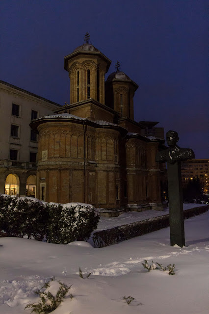
On my way to the hotel, I passed by that church in Bucharest numerous times, so naturally, it was one of the first locations I visited. At day it looked interesting enough, having architecture that has nothing to do with the rest of the churches around the old town. I loved the contrast between it (the locals told me it was a very old church) and the surrounding Communist-style buildings. It again reminded me of Saint Petka Samardzhiiska church in Sofia and its location.

The strange sculptures around it added to the surreal feeling. As if the church was not considered interesting enough and they added the 'artsy' part to brighten things up. As you can see from the daytime image, the church looked interesting, given the fact that its architecture drastically differs from anything you can see in Sofia, BUT still somewhat dull to me. It was a good shot but I aimed for the 'wow' factor so I decided to take as many images of the place as I can (it was so close to the hotel that I took one image on my way to the old town and another on my way back). 

The last evening in Bucharest, I managed to capture this - shot handheld in the blue hour. The place looks eerie and unwelcoming at night, its tall structure in total contradiction with the surrounding squat rectangular buildings. Even though this image is taken from the apse of the place (couldn't make it to the front entrance as the snow was more than knee-deep down the slope), it makes a better representation of the church as this is the view most tourists see (and neglect). 
The case with Saint Petka Samardzhiiska church (below) was even more interesting. I pass by this place literally every day so I have perfect idea of how it looks like at almost any time of the day. So my initial idea was to take some images of it during the blue hour because there is a wonderful contrast between the small church and the towering Stalinist architecture above it. 

I was quite pleased with the night result but decided to try out a day approach. At one point I wanted to create a series of the same place during the day and then at night and display the images side by side. That idea failed due to lack of time and the lack of lights in some places. Street lights ruined other images so I had to choose either or for each location. 

This one was so close to the stop I usually get off the tram, that I must have taken at least 100 images of it during this module, all during almost any type of weather and time of the day. However, I noticed that from all images, only those two stand out. At dusk the place looked dull because they turn off the lights very early in the morning and on relatively late in the evening. 

During the day it looks somewhat overlooked - even tourists who swarm the area each day rarely take the time to walk around and see the contrast. The church is tiny whereas the Triangle of Power above it is huge. No wonder why no one notices it.  


At night, however, things change and the church lights up with the rest of the complex. The lights of the passing cars put an emphasis on the busy crossroads and the angles of the buildings above it show even greater contrast.

Even though the day image is good - interesting cloudy sky and good light - the night image has more impact, at least to me, so I chose to put the night image in the portfolio. 


Project development - finding the unseen angles

Being a photographer means much more than just taking pictures. One of my beliefs is that you should strive to be unique and to show your own perspective, preferably something other people haven't thought of. This goes with double force for places that are famous tourist attractions and have been photographed very often. 

During this module I tried to find some unseen angles of places that are usually well-known in Bulgaria. One of my motivations was that I wanted to create something not that cliched and to try to show the places in a new perspective. 

However, it didn't work out well with all locations. Some, on the other hand, had a lot of potential for development. This place, the Russian church in Sofia, proved to be really fruitful in terms of angles. 

I have a soft spot for all kinds of reflections - especially puddles but not only - so once I am on location, I always look out for reflective surfaces. This church is surrounded by them - glossy shops, fancy restaurants with French windows and amazing view. I walk around that place almost on a daily basis on my way to the university and the city center. But before starting this module, I have rarely noticed the reflections, at least not through the lens. 

The thing with reflections is that they are the natural double exposure in camera and they offer a great variety of options. I love using real reflections to manipulate the viewer and add in new aspects of the image. For example, the two images of the Russian church show two different aspects of the surrounding area. 

The first one is in a shop window and my main motivation for taking this pic was the surveillance camera sign in the top right corner. The area is really fashionable and houses one of the most expensive hotels and restaurants in Sofia so the contrast between the surveillance of the camera and the overseeing of God looked almost comical to me when I saw the sign. 

This church get photographed every day by thousands of tourists and I was dead-set on not using the most famous angle of it. So this one was a natural choice. Still, there was something in that image that troubled me. I disliked the cars in the foreground and the blueish look of it all. So I decided to come back and retake it. 

Reflection in the window of a shop opposite the church
A few days later, I was passing by the church and looking at the French windows of the shops and restaurants (and my own reflection, too, as a natural woman) when I saw how well the church and the surrounding area was reflected in the window of this restaurant - an expensive Spanish tapas bar and diner. It was big enough to have not only the church but the surrounding buildings (the building on the right is the Natural Science museum, built in the 1950s) and the contrast between the two. I didn't have my camera with me so I decided to come back and use this angle.

When I came again, I was surprised to find out that the window itself added another two layers of the image - the tapas and wine sign and the tables in the foreground and the church next to it in the reflection made me think of that Biblical story of Jesus driving away the merchants from the temple. The chandelier lights from the inside showed on the reflection and added another layer because they looked so much as the chandeliers used inside churches. 

To me this angle (and obviously this window) worked much better than the previous one, both in terms of perspective and message. To me, there is much more to see here and much more to interpret. 


Since I love experimenting (and I wanted to create another interesting image of the place), I continued roaming around to see if I can do better. Then I saw the flowers and decided to use a low angle. 

Most tourists take a pic from afar - because the church has a wonderful small park around it and they plant different flowers in it each season. So the place is very picturesque. This year, they did even better as the flowers are lovely. So I got close (almost in the flowers and totally ignoring the keep off the grass sign for the sake of art) and did this. To me, it is much more tourist-oriented, looking more like a postcard but still it is an angle I haven't seen colleagues to use so I love the end result. 


Sunday, 22 April 2018

WIP development - finding an approach part 1

My idea to do my work in progress portfolio on religious buildings made me much more focused on my task than during the previous module. Even so, having a clear idea of what I want to photograph, didn't help me to get clear what aspects of it I want to photograph. 

Religious buildings, especially those in the city center, have a long and tangled history intertwined with that of the surrounding buildings. I am usually the type of person that starts telling the story of the surroundings so I wanted to have places that tell a story in my portfolio. However, since the overreaching theme was religion, I also wanted to try my hand out at creating more serene images that convey the feeling of communion with God. However, shooting inside the churches was not an option so I had to work out another way to convey that sense. 

It turned out that the serene approach worked with some locations better than others. For example, this place is the biggest church in Sofia and a symbol of Bulgaria too. It is such a famous place that it is somewhat if a cliche. However, I managed to capture this image - a reflection in a puddle that I love very much. 

I love the way this image looks because it definitely shows the place from a unique perspective - as a reflection in a puddle. I have a soft spot for puddles and whenever I see one, I try to find a reflection in it. The light in this image (shot handeld during the blue hour and in a snow storm) and the water give the impression of serenity and make the image surreal. It is not only a picture of a church and depicting its architecture. This is a replica of an older image I created, more or less in the same style but at different time during the day. 

However, it turned out that this was the only place I managed to photograph and get this effect. Not because there are too few puddles on the streets of Sofia but because only this pic worked out that well. 

All other places looked different and had different stories to tell. Still, my initial idea was to try and find a similar way to represent the other places of worship. The next place I tried to photograph like this was the Russian church in Sofia - it is an amazing place in terms of architecture and I very much hoped that I can find some reflections around it to achieve the same effect. 


I saw this reflection of the church in a nearby shop window and was attracted to the contrast between the church and the surveillance camera sign in the right corner. The only problem in this image was that it had totally different impact and idea. This image is more about the contrast between the old and the modern, the religious and the secular, whereas the previous one is more serene, not so straightforward and more open to interpretation. 

At that point during the module, I had no idea what exactly to focus on. Truth be told, I wanted to have it all. To show the different aspects of religious buildings. To create a coherent portfolio, however, I needed to focus on one aspect. 

Still, I had no idea on which aspect to choose. I wanted very much to create serene images like the first one BUT somehow things didn't always work out well. So, when I had the chance to visit Bucharest, all of a sudden, inspiration struck. 


It is a Catholic church in the centre of Bucharest, one of the places that made me think the first time I visited. The reason why this place speaks to me, is that the church is squeezed in between blocks of flats, obviously created during the Communist era, and looks a bit out of place. Imagine people living there, looking through the window and seeing the bell tower. It reminded me of a church in the centre of Sofia so this place was totally on my to-shoot list. 

When I took this image it dawned on me that most of the images I already had are similar to this. There is some contrast, there is a story. The places I wanted to photograph all had dramatic stories and weren't simply places of worship but buildings that needed to have their stories told. I've always been a fan of history so anywhere I go, I try to learn more about the things I see. 

This image changed my mind and I decided to go with the flow and create the images I wanted and focus on the contrast between the old and the new in the modern city. I found an approach but I was yet to find out what I needed. 

Sunday, 15 April 2018

Work in progress portfolio - reflections ethics, framing, timing and composition

I love photographing architecture because it is a huge part of travel photography. However, religious buildings have their own specifics and you need to photograph some concrete details that distinguish them from one another. What is more, these have to be recognizeable. 

The first challenge was framing and I had to choose between two approaches - one was to concentrate on details and show only that while the other was to show the whole building. I love photographing  architectural details but I decided that this approach will not be very effective when it comes to Orthodox churches since they are very similar in terms of style. The Orthodox tradition was established more than 1000 years ago and hasn't changed much since so choosing to shoot details only would have led to having very similar images that themselves cannot say much. 

Here is an example - this is a mural at the door of the church of my neighbourhood, dedicated to Saint  Prophet Elijah:


Overall, it is a good image showing an old mural BUT on the other hand, it tells nothing of the architecture of the place, especially to a non-specialist in medieval murals. 

Another vote against the 'detail' approach was the fact that photography is forbidden in almost all places of worship - Bulgarian Orthodox churches leading the way. Even if it is possible to pay and take a few pictures, I consider it unethical in some way since it is a place of worship and prayer, not a commercial museum and it should be treated with respect. Things get even more complicated with places such as mosques and cathedrals since I am not very well versed in the rules of worship and I prefer not to offend someone because of ignorance. No one would tell me off - places of worship are open to all - but it simply does not seem right to me. 

For this reason, I decided to concentrate on the overall view of the places I photograph. I've always been better at photographing the general view, the 'big' picture. Throughout the module I figured out that I prefer to tell the story behind the place I am photographing and to do this I needed to photograph the church AND its surroundings. 

I was advised to try tighter crop and use the square format and I did try it out but it didn't seem to work for me, or at least it doesn't work for all places: 


In the case of these two images it seems to create the desired impact but things look quite differently when it comes to more elongated shapes, such as the churches I saw in Romania: 


Shapes such as these will look too tight in square crop. Besides, I noticed that I am so used to shooting in rectangle format, that most images look well-composed only in this way. Re-framing them in square format cuts out some of the story of the place and makes the images too cluttered - since the whole surroundings are just as important as the place of worship. 

Timing proved to be an issue since some places look better at dusk whereas some are better-looking at daytime. So I decided to use the time that makes the place the most enticing or tells its story better. 

Wednesday, 11 April 2018

Critical contextualization of my work - inspiration talk - part 2.1 - foreign artists close to home

My fascination with travel photography started a long time ago and one of the people that sparked my interest was George Meis. More than six years ago, I came across some of his bookmark series in a small bookstore in Crete. I was mesmerized by his style, the locations and the colourful images so I immediately became a fan and started collecting the bookmarks (I am also an avid reader so it is a pleasure to not only have them but use them on a daily basis).

When I started doing Culture Crossroads, even before I was aware of it, Geogre Meis was one of the first people that came to my mind. Mainly because he does what I intend to do - he is Greek and has toured roughly all of Greece, photographing what's on offer regardless of time of the day, weather conditions and location. 

Fig. 1 Meis, George – Zakintos,  2017
George Meis does not stray from iconic locations, on the contrary, he is famous for capturing these places in a new way (which is an approach I also try to incorporate).

What I love about his style is that he shows Greece the way it is - sunny and hot (most of his images feature dull blue cloudless sky - from photographic point of view and endless blue sea). I am sure he could have created other images, similarly striking to those Krasi Matarov creates but instead, Meis creates images that correspond to what a visitor might encounter - especially if you go on vacation.

In this sense, the works of Meis are more similar to what I intend to create - document what I see on the spot rather than wait for months for one killer image. Meis has traveled around Greece and like me, his style tends to be more similar to the hunter approach - preferring to go around and "hunt" for locations, scenery or moments.

I also love that Meis seems to be more moderate in terms of image editing - no elaborate stacking, no multiple exposures, only (seems to me) colour enhancing. Meis' images seem bright, full of life.

I do not always agree with his choice of framing though - such as this image of the iconic town in Santorini island, Oia:

Fig 2. Meis, George –  Santorini,  2017
This image, shows the iconic location for landscape sunset shots at Santorini but obviously when Meis went there, the scene was nothing like amazing. Nevertheless, he still took a picture and it can be seen on the home page of his website. This one, at least to me, is not good enough - it does show Meis' signature style and post-processing technique BUT to me this is simply not good enough. I would have waited for either the blue or the golden hour. Even though, the image as presented is an unconventional way to show an otherwise clichéd location (this terrace in Oia must have been photographed by millions of tourists), I would like to create images that stand out.

After all, Meis has spent the better part of his life working to turn his name into a brand whereas I doubt many people know me so I am rather reluctant to do this (yet).

Still, I love his documentary-yet-pleasing approach and the bright colours (somehow, fail to see the world in monochrome) but as for the excessive contrast (which seems to be quite boosted in some images) I'd rather tone it down. Another matter is, that sometimes the Mediterranean sea looks  in surreal shades of blue that are perfectly real, if you have been there to see for yourself, as with this image of the harbour at Rhodes:

Fig.3 Meis, George – Rhodes,  2017
To me, the images of Meis speak of a warm welcome, beautiful landscapes and long tangled history. I've been in love with his work for such a long time that I am afraid my critical assessment of it is rather biased. I'd love to create images that document what I see and that are true to what I see (without the excessive over-editing) but I would also want that dream-like qualities of the images of Krasi Matarov.

More on inspiration and influence - in the next post. 

References: 

Geogre Meis official website
Available at:
http://meisstudio.gr/about/
[accessed 11 April  2018]

List of figures:

Figure 6 – MEIS, George – Zakintos,  2017
Available at:
http://meisstudio.gr/about/
[accessed 11 April  2018]

Figure 7 – MEIS, George – Rhodes,  2017
Available at:
http://meisstudio.gr/about/
[accessed 11 April  2018]

Figure 8 – MEIS, George – Santorini,  2017
Available at:
http://meisstudio.gr/about/
[accessed 11 April  2018]

Critical contextualization of my work - inspiration talk - part 1 - local artists

Throughout the years, I've been inspired by a pot of people but there are a few that stand out. 

The first one that has left his mark on my work is the Bulgarian photographer Krasimir Matarov, working under the pseudonym Krasi St M. I especially admire him and his work because he started from scratch, just like me. 

Krasi is originally a Russian language teacher and up till 2012 he was just a hobby photographer. He said (we actually know each other) that he learned editing before anything else, even before owning a camera. His career took a turn when he won the 2013 Sony World Photography Awards in the Open Nature category. The winning shot was this one: 

Fig. 1 a screen grab from the BBC news website Krasi used as his cover photo in 2013
 After the victory, Krasi switched jobs and became a full-time photographer, tutor and lecturer. I've always been interested in his career path, mainly because this is the desire of most photographers - getting famous and making money from what you love. Krasi started with macro shots but it soon became clear that landscape and travel images are his true element.


Fig 2. Krasi St M – Kardzhari dam,  2018

What I admire about his style is that he manages to discover the unseen angle or setting in even the most banal of locations - such as this one, known as 'the photographers' turn' in Bulgaria, a favourite place for photographers to try their hand at landscapes. 

Krasi manages to create a dreamy-like atmosphere and his images just draw you into the scene, make you crave to be there, see the place as he did. This is exactly the same thing I am aiming at. I love the way he manages to capture the subject, such as this image of Chinque Terre (not sure which one of the 5 villages is this, though)

Fig. 3 Krasi St. M - Chinque Terre, 2018
His images are always dramatic, almost never plain or dull. Unfortunately, our approaches differ in two ways - travel duration. For example, Krasi can afford to spend a week or two at a certain location, just to be sure that he has got the perfect shot, whereas due to travel expenses, I cannot afford to do so (and that goes for almost any location, I'm afraid). He also climbs mountains and sleeps in a tent (and totally lack that adventurous streak). 

Hence, sometimes I just need to visit a place several times to get the desired effect. For example, this image of the 'photographers' turn' is good but it is nowhere near the one Krasi created, in terms of impact: 


The two boats do make something of the image and emphasize the curves BUT apart from that the weather was not on my side. 

I admire Krasi for his stunning landscapes but sometimes despise the over-editing in some of them. He often stacks images to create a more stunning view (some of the most amazing works in his portfolio are actually made of 4 to 10 different exposures post-processed in a hundred and one ways for maximum impact). To me, this kind of over-editing is indeed eye-catching BUT somehow the objectivity of the image is lost. 

Especially in what I am trying to do, this kind of landscapes will not work well - when you advertise tourism, you should at least try to stay closer to the actual place (which is one of the reasons I do behind-the-scenes videos) so that people see I have my way of portraying things but they are there, they exist and have not been photoshoped into something different. 

I agree with Krasi that toning the images sometimes results in better impact and when it comes to capturing customs or the character of a particular event, he is definitely someone I look up to. 

Fig. 4 Krasi St M –  Yordanovden,  2017
This image portrays an amazing ritual that marks the beginning of January. In Kalofer, a small mountain town in Central Bulgaria, they have the tradition of ice horo which means that all men from the town dance in the ice-cold (and as you see, often frozen) waters of the river that runs through the town . His images of the ritual last year are one of the best I have ever seen portraying it. He toned down all tones except the blue to emphasize the cold and manages to get a shot of the dancers entering the icy waters of the river. 

I admire Krasi's ability to capture the air of the ritual, no matter if it is something indiginous and authentic, such as this Bulgarian ritual, dedicated to Saint Haralampi: 

Fig. 5 Krasi St M –  Untitled,  2018
This is a ritual done in Bulgarian churches once a year (I don't know much since I found out it existed from this image) and Krasi managed to capture the mood in the church during the ritual without looking like an intruder. This is an ability I am also trying to master. 

Krasi is especially good at creating iconic images, that capture the characteristic features of a particular place, person or area, such as this Mongolian eagle hinter: 

Fig. 6 Krasi St M –Mongolia,  2017
I also aim to create images that would wow the viewer. In this one there are a lot of elements - good composition, interesting subjects, and a touch of action. Such images tell a story so I definitely look up to Krasi for inspiration though we may disagree on post-processing (especially on landscapes). 

Still, he is not the only one that inspires me but I'll talk about this in a follow-up post. 

References: 

Krasi Matarov’s Facebook page
Available at: https://www.facebook.com/KrasimirStM/ [accessed 11 April  2018]

List of figures: 

Figure 1 – MATAROV, Krasimir - Untitled, 2013
Available at: https://www.facebook.com/KrasimirStM/photos/rpp.374656352553372/1954188034600188/?type=3&theater
[accessed 10 April  2018]
Figure 2 – MATAROV, Krasimir - Chinque Terre, 2018
Available at: https://www.facebook.com/KrasimirStM/photos/rpp.374656352553372/1954188034600188/?type=3&theater
[accessed 10 April  2018]
Figure 3 – MATAROV, Krasimir - Kardzhari dam, 2018
Available at: https://www.facebook.com/KrasimirStM/photos/a.600574433294895.1073741825.374656352553372/1900995666586092/?type=3&theater
[accessed 10 April  2018]
Figure 4 – MATAROV, Krasimir – Untitled, 2018
Available at:
https://www.facebook.com/KrasimirStM/photos/a.600574433294895.1073741825.374656352553372/1852494461436213/?type=3&theater
[accessed 10 April  2018]
Figure 5 – MATAROV, Krasimir - Yordanovden,  2017
Available at:
https://www.facebook.com/KrasimirStM/photos/a.600574433294895.1073741825.374656352553372/1774221942596799/?type=3&theater
[accessed 10 April  2018]
Figure 6 – MATAROV, Krasimir - Mongolia,  2017
Available at:
https://www.facebook.com/KrasimirStM/photos/a.750552084963795.1073741840.374656352553372/1444946392191024/?type=3&theater
[accessed 10 April  2018]


Friday, 8 December 2017

Project development - Thinking quick or what happens when weather and web hosting sites are against you

In the previous post I talked about how glad I was to find a whole database with information, addresses and pictures of abandoned houses around Sofia. I even wrote to the page - fading Sofia
 - for collaboration and waited for a response. 

At that point I thought I had done my homework BUT no, nothing like this. 

Imagine my surprise when I searched for it yesterday (Thursday was planned for house-hunting) and saw this message: 


I was absolutely puzzled and worried - after all, I counted on this website to finish my work in progress portfolio - and I have no exact notion of all houses I could possibly visit. So I decided to check out more about the project and it turned out it is more than sever years old (started around 2010) so it is quite possible they didn't pay the hosting fee so they may not be live again within the next few weeks, or at all. So far for the easy way.

Worse still, due to awful weather last week (blizzard and heavy snowfall and then temperatures around -8 Celsius) the only thing I had done were these:
Eagles' bridge - one of the most famous crossroads in Sofia. I pass through it several times a day so this was one of the first images I took (with the smallest compact camera I just had in me)

This image looks very Soviet (or post-Soviet dystopian) to me. This is the monument of the Soviet army in Sofia (unique architecture and quite the controversial history). This boy just passed by and the shot works for me. The scene may be anywhere in the post-totalitarian Eastern Europe (unless, of course you know the place). 

St. Alexander Nevski church - the biggest, most famous and most visited church in Sofia (literally one of the emblems of the city) and this is its main entrance. What you can see in the image is not rain, these are snowflakes.
They may be good in a sense BUT they had nothing to do with the set topic for my work in progress portfolio this module - abandoned buildings. What made matters even worse was the fact that I couldn't roam around the city, looking for something I have no clear coordinates for in the blizzard (which didn't stop for two days - these images are taken on day 1 when it was just warming up). So I had to wait. I am posting the unedited versions of the pics here :) 

So, this week I had to make things work and find at least one house to photograph - fortunately, due to helpful neighbours (and to the subtle yet important fact that Eastern Europeans are highly suspicious to anyone wandering around their neighbourhood) - found three houses - all built within 500 meters from each other, practically on the same land plot. 

One of the neighbours told me that most of them are still in use and, despite the decrepit looks are not abandoned. To my shocked face he reacted with the explanation that the municipality forbade any repair works on houses smaller than 50 (or 70, I am not sure) square meters. For the sole reason that this way these will sooner or later fall down and make way for blocks of flats. Who cares about cultural heritage?!

More information on that in a follow-up post (when I edit the images) :)

Friday, 10 November 2017

Beyond the Postcard mini project - struggles with scope - or how to get a focus of your work in progress portfolio

'Darling, I write a long letter because I didn't have the time to make it short.'

I've never been good with writing short pieces. Each time I get a word count, I usually exceed it with, well, maybe a third. There's so much to say and so many ideas going on in my head that I just cannot put myself through this.

It seems, same goes for photography. For years, I've been told that I should specialize in one or two areas of photography, the implication being that I would be better at what I'm doing if I focus on less than 15 things at a time. For years, I refuse to discard the genres I love. Somehow, cannot make myself overlook that amazing scenery in favour of the architecture in the background. 

When I go somewhere, I take pics of anything that appeals to me, regardless of genre (OK, maybe I tend to avoid some things but most of the time I come back with quite the versatile portfolio). 

Naturally, when I had to devise a project for Falmouth, I came up with a topic that would encompass everything I love: travel, landscapes, food etc. This idea sounds great when you take into account the whole lot of work I have to put in it - go to a place, take a picture, put the picture online, then write a blog post about it and tell the whole back-story. 

That's how I created Culture Crossroads - currently I have a Facebook page and blog - the place where I will try to show the place where I come from, the Balkans, the way I see it - as something worth visiting, much more than just a cheap tourist destination.

So far, so good BUT it turned out that I count way too much on writing to explain to people what they see on the image than to just create a coherent body of work (for example - 14 images that tell a story without me lecturing in the background).

Struggling head-on with the education system in the UK (which, honestly, has NOTHING to do with anything in Bulgaria), I was quite disappointed with my result from the previous module. So this module I was dead-set on doing something better. I've always been a perfectionist so to me any score below the highest one possible is a failure. 

So, unlike the previous module when I traveled around Bulgaria to capture some amazing yet less-known places around the country. This required a lot of logistics and travel in a time not exactly great for photography (July and the beginning of August in Bulgaria are any photographer's nightmare with intense heat and dull blue skies). So, to me, the portfolio of 12 images LOOKED coherent - after all, it was all in Bulgaria, it was beautiful and less-known. 

One of the images from last module's portfolio - known as the Flooded church.
Amazing place with interesting history behind it. 
 When I started compiling the work in progress portfolio for this module, though, it became clear that if I want to get the message across with my work, I will have to focus on one thing in particular. To me all images matter and have some meaning BUT to people outside of my head, obviously things didn't work that way. 

In some sense, pursuing a degree in Cultural studies and having a keen interest in history, I tend to take for granted things that other people deem specialized knowledge. It was particularly puzzling when I got feedback such as 'you should try to keep the horizon line straight' for the image with the church. At that time I was puzzled because I really have problems with keeping the horizon line straight when I'm shooting so I went the extra mile to straighten it. Then, it occurred to me to zoom in the image and I saw that what my tutor referred to was actually the waterline of the dam in the distance that does not coincide with the actual horizon. 

Another case - same module, same portfolio - was this image: 


What totally puzzled me in the feedback was the advice to 'correct converging verticals'. To me, there are NO converging verticals as it is a tomb - here is exactly what I wrote back: 

The image from the Thracian temple, also has converging verticals in some sense but this is not only due to the lens I used (Canon 10-18 at 10mm) but to the architecture of the place itself. 
To me it's obvious how this thing looks like in real life but I've been to numerous such places and didn't even think it would need any explanation but it dawned on me it badly does :)

It is a dome-like structure (I've attached the plan of the place as a JPEG) and all lines do converge at the top. Even though it is the biggest Thracian temple in Bulgaria, it is less than 5 meters in diameter so it is a really small enclosed space. I actually tried to correct the verticals but that led to twisting the other lines in the image (I've also attached my lame attempt to do this) because of the way these things are built. Since more images of Thracian tombs and temples are coming, I attached a bit of information as well. 
So, having been to more than a dozen such places, I didn't even think that anyone would consider the look of this image as a technical mistake. BUT obviously things weren't the case. 

Here is a diagram of how the place above actually looks like - the architectural differences, I mean: 

A diagram of the place - as you can see, the burial chamber is round and dome-like so technically there are no straight lines anywhere. But that is something I know and I cannot put as a text while submitting the work in progress portfolio. 
While writing this, it dawned on me that I can count on the back-story of the place to explain the viewer what the thing is and why it is significant. Throughout the years, I've discovered that images with a story do better than images with just a title so on my page, I always try to tell the story behind the shot. So, it was only natural that I adopted the tried and tested (and proven to perform well) practice to my new project. 

BUT when it comes to submitting a portfolio of a few images with titles only, consistency is not something that works the same way as on a Facebook page or a blog where you have extensive explanations going on with every image. 

What is more, Culture Crossroads has 6 categories - to make the narrative work, I had to break it down into some kind of meaningful chunks. So here are my 6 categories: 

  • Feel the Religion
  • Admire Architecture
  • See Nature
  • Be Part of Culture
  • Experience the Present
  • Remember the Past

BUT at the time I cannot just throw in a few images from each category because, as my first work in progress portfolio proved, it simply doesn't work. When I first submitted it, I had no idea what I was doing - so far, since that's my first-ever formal training in photography, I've figured out how to present single and most of the time - isolated images. Never a coherent body of work. So I had no idea what the problem was...

Then I went to Crete and came back with amazing images (some of which even of the WOW type that make you look twice and crave to visit the place). When I compiled a trial portfolio for a webinar though, it turned out that coherence is STILL a problem (ugh!). Here is why:
I chose to start chronologically so this was the first image in the portfolio - a breathtaking sunrise at Iraklio port (Iraklio is the capital of Crete)
As much as I adore this image - really, I'm not much of a lark type of person so I genuinely hate getting up so this is one of the rare and beautiful sunrise images I have in my portfolio - I was told that it, and many of the other images, does not fit in with the rest. Why? Because what I am showing in the portfolio is too versatile (that thing just backfired on me). 

Same goes for this image: 


It is a Venetian fort famous for its ghosts that appear at the end of May. Long story short, it's a haunted place. Amazing architecture. BUT this one and the one from the port have few things in common:
  • both are on Crete
  • the fortress above and the one at the port (seen in the background) are both created by the Venetians around the same time
  • they are both museums

Similarities end here (if we set aside the architectural similarities which I can point out but are of no relevance to my work as a photographer - at this stage - since I don't have images of the insides of the fortress at Iraklio). 

While, flipping though the images from Crete and choosing what to include in the portfolio, I collected everything that spoke to me in some way. That's how this image ended up on the last slide of my presentation: 

This is an abandoned house and I took the image through the window. It looks really creepy to me - maybe because in Bulgaria abandoned places are usually deemed dangerous and haunted - but I can almost see someone (ghost, zombie, whatever) creeping in though one of these doors.
There must be something in this image because both the tutor and my peers loved it. I too am keen on taking pics of abandoned houses and I admit it is a powerful message - especially if I start telling you the back-story of the place and its location - but somehow I thought of the other images (which are much more appealing to the non-trained eye) were better. Nevertheless, I agreed to search through the images from Crete and find some more abandoned places. And they started forming a pattern: 

Abandoned windmill, again on Crete

Ancient Doric town of Lato
Naturally, there was a proposal that I do just abandoned places for my project BUT the versatile nature of my photographic experience rebels against the very concept of narrowing things down this much. I simply cannot do this for various reasons:

  • entering abandoned buildings is illegal and it's deemed trespassing in Bulgaria - you can get into a lawsuit, the police station or even hospital for that. Many buildings are left to rot on purpose so that the land would be reused for some new buildings. Even if the place is a historical monument, it can STILL be left to rot.
  • some buildings can be photographed only from the outside
  • I really want to do the full scope of the project (and have all categories developed)

These were some of the cons I had to list. 
On the other hand, one of the points of my project is to break the stereotypes of travel and tourism in the Balkans - there is much more to see and experience than just the resorts and the cheap alcohol. So these images - well, some of them really - especially those places with a story (like the Venetian fort or the flooded church) - have a powerful impact and a message. 

That's why I decided that I'll try, at least, to present a portfolio of abandoned places only - some in Bulgaria, some on Crete - to show a more coherent body of work, for the sake of good presentation :) 

This, however, doesn't mean that I will be setting aside my whole concept of the project - on the contrary - I will select coherent images from the current pool of images (because this module I came up with a huge amount of files and topics to choose from) and see if I can make it work this way. 

Next module, I'll choose another aspect of the Culture Crossroads to present (while keeping the work on all aspects available - because different times of the year offer different things to shoot). That's how I intend to enrich my project and still keep the work I submit for grading focused (while avoiding the too narrow scope). 

So - say hello to the subsection of Admire Architecture - Beyond the Postcard which will show abandoned buildings across the Balkans (wherever and whenever I find them). 

Guardian of the past

Or what happens when you decide to edit an archive shot with the idea of showing that you are a better editor than your pervious...