Showing posts with label equipment. Show all posts

Monday, 23 April 2018

Project development - night VS day

One of the biggest challenges during this module turned out to be the selection of a suitable time for shooting. My initial idea was to take night shots only and the location allowed it. I live in Sofia so getting to the city center at almost any time of the day is not a problem. 

However, the blue hour turned out to be too short for me to tour all locations so I had to change plans a bit - especially when I noticed that some churches, even though they are amazing in terms of architecture, are not lit at night so I had to reconsider if I wanted them in the portfolio. 

When I went to Bucharest, things changed even more because I couldn't take my tripod with me (the airport authorities wouldn't have liked it). Besides, I was in a foreign country and roaming around the town alone so it wasn't exactly a good idea to stay for a long time after dark. I can go home at any time once I am in Sofia, but I wasn't OK with testing my luck in any other foreign capital. I am simply not that adventurous. 

The results of my walks around Sofia and Bucharest proved my hypothesis that some places look better at night whereas others are much more stunning during daytime. 

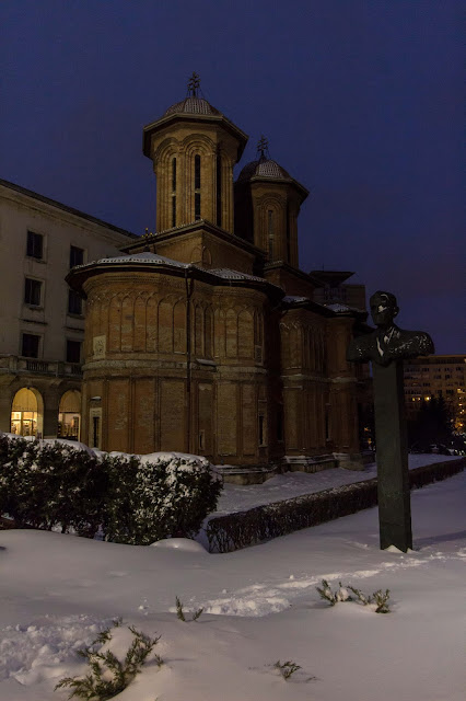
On my way to the hotel, I passed by that church in Bucharest numerous times, so naturally, it was one of the first locations I visited. At day it looked interesting enough, having architecture that has nothing to do with the rest of the churches around the old town. I loved the contrast between it (the locals told me it was a very old church) and the surrounding Communist-style buildings. It again reminded me of Saint Petka Samardzhiiska church in Sofia and its location.

The strange sculptures around it added to the surreal feeling. As if the church was not considered interesting enough and they added the 'artsy' part to brighten things up. As you can see from the daytime image, the church looked interesting, given the fact that its architecture drastically differs from anything you can see in Sofia, BUT still somewhat dull to me. It was a good shot but I aimed for the 'wow' factor so I decided to take as many images of the place as I can (it was so close to the hotel that I took one image on my way to the old town and another on my way back). 

The last evening in Bucharest, I managed to capture this - shot handheld in the blue hour. The place looks eerie and unwelcoming at night, its tall structure in total contradiction with the surrounding squat rectangular buildings. Even though this image is taken from the apse of the place (couldn't make it to the front entrance as the snow was more than knee-deep down the slope), it makes a better representation of the church as this is the view most tourists see (and neglect). 
The case with Saint Petka Samardzhiiska church (below) was even more interesting. I pass by this place literally every day so I have perfect idea of how it looks like at almost any time of the day. So my initial idea was to take some images of it during the blue hour because there is a wonderful contrast between the small church and the towering Stalinist architecture above it. 

I was quite pleased with the night result but decided to try out a day approach. At one point I wanted to create a series of the same place during the day and then at night and display the images side by side. That idea failed due to lack of time and the lack of lights in some places. Street lights ruined other images so I had to choose either or for each location. 

This one was so close to the stop I usually get off the tram, that I must have taken at least 100 images of it during this module, all during almost any type of weather and time of the day. However, I noticed that from all images, only those two stand out. At dusk the place looked dull because they turn off the lights very early in the morning and on relatively late in the evening. 

During the day it looks somewhat overlooked - even tourists who swarm the area each day rarely take the time to walk around and see the contrast. The church is tiny whereas the Triangle of Power above it is huge. No wonder why no one notices it.  


At night, however, things change and the church lights up with the rest of the complex. The lights of the passing cars put an emphasis on the busy crossroads and the angles of the buildings above it show even greater contrast.

Even though the day image is good - interesting cloudy sky and good light - the night image has more impact, at least to me, so I chose to put the night image in the portfolio. 

Sunday, 15 April 2018

Work in progress portfolio - reflections ethics, framing, timing and composition

I love photographing architecture because it is a huge part of travel photography. However, religious buildings have their own specifics and you need to photograph some concrete details that distinguish them from one another. What is more, these have to be recognizeable. 

The first challenge was framing and I had to choose between two approaches - one was to concentrate on details and show only that while the other was to show the whole building. I love photographing  architectural details but I decided that this approach will not be very effective when it comes to Orthodox churches since they are very similar in terms of style. The Orthodox tradition was established more than 1000 years ago and hasn't changed much since so choosing to shoot details only would have led to having very similar images that themselves cannot say much. 

Here is an example - this is a mural at the door of the church of my neighbourhood, dedicated to Saint  Prophet Elijah:


Overall, it is a good image showing an old mural BUT on the other hand, it tells nothing of the architecture of the place, especially to a non-specialist in medieval murals. 

Another vote against the 'detail' approach was the fact that photography is forbidden in almost all places of worship - Bulgarian Orthodox churches leading the way. Even if it is possible to pay and take a few pictures, I consider it unethical in some way since it is a place of worship and prayer, not a commercial museum and it should be treated with respect. Things get even more complicated with places such as mosques and cathedrals since I am not very well versed in the rules of worship and I prefer not to offend someone because of ignorance. No one would tell me off - places of worship are open to all - but it simply does not seem right to me. 

For this reason, I decided to concentrate on the overall view of the places I photograph. I've always been better at photographing the general view, the 'big' picture. Throughout the module I figured out that I prefer to tell the story behind the place I am photographing and to do this I needed to photograph the church AND its surroundings. 

I was advised to try tighter crop and use the square format and I did try it out but it didn't seem to work for me, or at least it doesn't work for all places: 


In the case of these two images it seems to create the desired impact but things look quite differently when it comes to more elongated shapes, such as the churches I saw in Romania: 


Shapes such as these will look too tight in square crop. Besides, I noticed that I am so used to shooting in rectangle format, that most images look well-composed only in this way. Re-framing them in square format cuts out some of the story of the place and makes the images too cluttered - since the whole surroundings are just as important as the place of worship. 

Timing proved to be an issue since some places look better at dusk whereas some are better-looking at daytime. So I decided to use the time that makes the place the most enticing or tells its story better. 

Friday, 13 April 2018

Critical contextualization of my work - inspiration talk - part 2.2 - foreign artists far from home

Speaking of inspiration, it does not end with local artists. One of the photographers I look up to is based at the other end of Europe. 

His name is Frank Leinz and he is also an avid landscape and travel photographer. I came across his works by pure chance, someone from my Facebook friend list had shared an image of his and I immediately became a fan. Truth be told, I often use Facebook to scout for amazing photographs and use groups as both a means to promote my work AND a way to learn. 

Frank is a also a travel photographer BUT unlike Krasi Matarov he is not a fan of camping at the place for days to get the perfect shot. I love his ability to create dream-like scenes, regardless of the weather conditions, season or location:

Fig 1 –  Leinz, Frank – Mystery Castle,  2016
Leinz was obviously lucky with the mist and the drama in the clouds but apart from that, there is something subtle in the image. It is still a very popular location, Burg Eltz castle in Germany but it doesn't scream out loud "I am a commercial" or "I am a cliché" and I try to incorporate this into my approach, too. This is a very popular 'photographic' place but as you can see from the pic, there is no one in the frame. No humans, not even a silhouette. 

We have that trait in common as we both tend to leave people out of the frame. I have had this habit  ever since 2010 - it all started with a excursion to Italy during Easter when more than 10 million people had the same thing in mind. To avoid having crowds in my shots, I had to devise a way to avoid having people in the frame (wasn't that at image editing good to clone them out). Ever since, I always try to keep the 'human population' in an image to the minimum. 

One of the reasons I came up with is that some scenes look better without a living soul around to give you the impression that you are the only one seeing this now, as if you are in the image itself. Another reason is that to me, images with lots of tourists in them may have some documentary value BUT they look rather like the snapshots most tourists come home with than the images I aim at. 

Fig2 –  Leinz, Frank – Beangil Sea Cave,  2016
The image above is taken at a very popular beach in Portugal, favourite to all visitors but still, Leinz made sure that no one is 'blocking' the view and if you see the place, you are the only human being in the frame (if we count out the photographer that created it). 

Ever since I applied for Falmouth, I've tried to experiment with putting a human element into the frame to get more 'artsy' images and I started questioning this habit. 

This image is one of my attempts to put people in the frame (which would normally be left without them) to get more impact:

To me, this image really works - because the place, Rila monastery in Bulgaria, is also very famous all over the Balkans. I have visited multiple times and I've tried to keep people out of the frame. The last time I went there, in December 2017, I added this image of the person getting out of the monastery. My initial idea was to keep him as a silhouette. One of my motivations was that I haven't seen anyone do something like this and I was looking for unique angles.

Another thing I admire about Frank Leinz' work is the use of long exposure in some images, such as this one:

Fig 3. Leinz, Frank - Pure, 2016

It is a classic landscape technique, especially effective in scenes when there is some water and kind of a cliche but I keep adoring the dreamy impact it has, maybe because the human eye cannot catch that slow motion. 

Another reason I fall for images like this is that I lack the patience (and the opportunity/ logistics) to create something like this. I would really like to try it but I rarely have the time to wait that long at a location (and I suspect I lack in equipment, too). 

Still, I will try to make an effort and see if the technique would work for me. 


References: 
  • Frank Leinz’s Facebook page

Available at:
https://www.facebook.com/fldesign.info
[accessed 13 April  2018]

List of figures:

Figure 1 – LEINZ, Frank – Mystery Castle,  2016
Available at:
https://www.facebook.com/fldesign.info/photos/a.502329203234609.1073741828.502320593235470/892397237561135/?type=3&theater 
[accessed 13 April  2018]
Figure 2 – LEINZ, Frank – Beangil Sea Cave,  2016
Available at:
https://www.facebook.com/fldesign.info/photos/a.502329203234609.1073741828.502320593235470/857367027730823/?type=3&theater 
[accessed 13 April  2018]
Figure 3 - Leinz, Frank - Pure, 2016
Available at:
https://www.facebook.com/fldesign.info/photos/a.502329203234609.1073741828.502320593235470/810809369053256/?type=3&theater
[accessed 13 April  2018]

Wednesday, 11 April 2018

Critical contextualization of my work - inspiration talk - part 1 - local artists

Throughout the years, I've been inspired by a pot of people but there are a few that stand out. 

The first one that has left his mark on my work is the Bulgarian photographer Krasimir Matarov, working under the pseudonym Krasi St M. I especially admire him and his work because he started from scratch, just like me. 

Krasi is originally a Russian language teacher and up till 2012 he was just a hobby photographer. He said (we actually know each other) that he learned editing before anything else, even before owning a camera. His career took a turn when he won the 2013 Sony World Photography Awards in the Open Nature category. The winning shot was this one: 

Fig. 1 a screen grab from the BBC news website Krasi used as his cover photo in 2013
 After the victory, Krasi switched jobs and became a full-time photographer, tutor and lecturer. I've always been interested in his career path, mainly because this is the desire of most photographers - getting famous and making money from what you love. Krasi started with macro shots but it soon became clear that landscape and travel images are his true element.


Fig 2. Krasi St M – Kardzhari dam,  2018

What I admire about his style is that he manages to discover the unseen angle or setting in even the most banal of locations - such as this one, known as 'the photographers' turn' in Bulgaria, a favourite place for photographers to try their hand at landscapes. 

Krasi manages to create a dreamy-like atmosphere and his images just draw you into the scene, make you crave to be there, see the place as he did. This is exactly the same thing I am aiming at. I love the way he manages to capture the subject, such as this image of Chinque Terre (not sure which one of the 5 villages is this, though)

Fig. 3 Krasi St. M - Chinque Terre, 2018
His images are always dramatic, almost never plain or dull. Unfortunately, our approaches differ in two ways - travel duration. For example, Krasi can afford to spend a week or two at a certain location, just to be sure that he has got the perfect shot, whereas due to travel expenses, I cannot afford to do so (and that goes for almost any location, I'm afraid). He also climbs mountains and sleeps in a tent (and totally lack that adventurous streak). 

Hence, sometimes I just need to visit a place several times to get the desired effect. For example, this image of the 'photographers' turn' is good but it is nowhere near the one Krasi created, in terms of impact: 


The two boats do make something of the image and emphasize the curves BUT apart from that the weather was not on my side. 

I admire Krasi for his stunning landscapes but sometimes despise the over-editing in some of them. He often stacks images to create a more stunning view (some of the most amazing works in his portfolio are actually made of 4 to 10 different exposures post-processed in a hundred and one ways for maximum impact). To me, this kind of over-editing is indeed eye-catching BUT somehow the objectivity of the image is lost. 

Especially in what I am trying to do, this kind of landscapes will not work well - when you advertise tourism, you should at least try to stay closer to the actual place (which is one of the reasons I do behind-the-scenes videos) so that people see I have my way of portraying things but they are there, they exist and have not been photoshoped into something different. 

I agree with Krasi that toning the images sometimes results in better impact and when it comes to capturing customs or the character of a particular event, he is definitely someone I look up to. 

Fig. 4 Krasi St M –  Yordanovden,  2017
This image portrays an amazing ritual that marks the beginning of January. In Kalofer, a small mountain town in Central Bulgaria, they have the tradition of ice horo which means that all men from the town dance in the ice-cold (and as you see, often frozen) waters of the river that runs through the town . His images of the ritual last year are one of the best I have ever seen portraying it. He toned down all tones except the blue to emphasize the cold and manages to get a shot of the dancers entering the icy waters of the river. 

I admire Krasi's ability to capture the air of the ritual, no matter if it is something indiginous and authentic, such as this Bulgarian ritual, dedicated to Saint Haralampi: 

Fig. 5 Krasi St M –  Untitled,  2018
This is a ritual done in Bulgarian churches once a year (I don't know much since I found out it existed from this image) and Krasi managed to capture the mood in the church during the ritual without looking like an intruder. This is an ability I am also trying to master. 

Krasi is especially good at creating iconic images, that capture the characteristic features of a particular place, person or area, such as this Mongolian eagle hinter: 

Fig. 6 Krasi St M –Mongolia,  2017
I also aim to create images that would wow the viewer. In this one there are a lot of elements - good composition, interesting subjects, and a touch of action. Such images tell a story so I definitely look up to Krasi for inspiration though we may disagree on post-processing (especially on landscapes). 

Still, he is not the only one that inspires me but I'll talk about this in a follow-up post. 

References: 

Krasi Matarov’s Facebook page
Available at: https://www.facebook.com/KrasimirStM/ [accessed 11 April  2018]

List of figures: 

Figure 1 – MATAROV, Krasimir - Untitled, 2013
Available at: https://www.facebook.com/KrasimirStM/photos/rpp.374656352553372/1954188034600188/?type=3&theater
[accessed 10 April  2018]
Figure 2 – MATAROV, Krasimir - Chinque Terre, 2018
Available at: https://www.facebook.com/KrasimirStM/photos/rpp.374656352553372/1954188034600188/?type=3&theater
[accessed 10 April  2018]
Figure 3 – MATAROV, Krasimir - Kardzhari dam, 2018
Available at: https://www.facebook.com/KrasimirStM/photos/a.600574433294895.1073741825.374656352553372/1900995666586092/?type=3&theater
[accessed 10 April  2018]
Figure 4 – MATAROV, Krasimir – Untitled, 2018
Available at:
https://www.facebook.com/KrasimirStM/photos/a.600574433294895.1073741825.374656352553372/1852494461436213/?type=3&theater
[accessed 10 April  2018]
Figure 5 – MATAROV, Krasimir - Yordanovden,  2017
Available at:
https://www.facebook.com/KrasimirStM/photos/a.600574433294895.1073741825.374656352553372/1774221942596799/?type=3&theater
[accessed 10 April  2018]
Figure 6 – MATAROV, Krasimir - Mongolia,  2017
Available at:
https://www.facebook.com/KrasimirStM/photos/a.750552084963795.1073741840.374656352553372/1444946392191024/?type=3&theater
[accessed 10 April  2018]


Tuesday, 20 March 2018

Collaborations - how to promote a budding project part 2

Having 'done my homework' with social media, I started looking for other ways to promote my works and the project as a whole. The first idea that came to my mind was to try and collaborate with someone. My first and most logical choice was to write an email to the Fading Sofia project and ask they if they need better images for their website, the idea being that I use their information and make sure to include a link to their page whereas they use my pictures and include a link to my page. 
Here is how their home page looks like - if you click on a point, you see the location and an image of the place so I'd love to have my images there. 


In a previous post I wrote that the site was down and probably that mail was lost somewhere so I might need to write up again as the site functions anew. It is very well indexed on Google and the project as a whole aims to tell stories so I'd love to work with them. 

Another collaboration opportunity I noticed was the recent launch of Balkanium magazine. I came across it in a sponsored post on Facebook and I checked it out. 


To give you an insight of what the project is about, I will quote their info page:

'Balkanium is a photography magazine that was started as a documentary photography master degree project in Belgrade, Serbia. Main intention is to show interesting moments of life and people of the Balkans, that will spread a bit more positive view of this region and life in general. Also, people and countries of the Balkans are not enough connected, beside classic media information’s that are mainly focused on political themes and events. We thought that we should build a platform where we can learn about each other more through photo stories about different people and themes around us. Professional photographers will be here to create that bond and platform.
Balkanium tends to make a team of photographers, one from each Balkan country. If You are interested You can read more here. Balkanium stories exist to try to break some prejudices, make someone’s day, and share quality information’s in the sea of others.
Anđela Petrovski
Photographer and Founder'
I wrote a quick email and explained that we can help each other since our projects have a lot in common and explained that I seek to popularize my project on their magazine as well and they were delighted to have me. Now, there is an open call for photographers to submit articles and I am about to send out my first story for publication within the next few weeks. 

Another collaboration I found useful was with the colleagues from Patepis.com - the biggest travel website and blog in Bulgaria. This is a screengrab of my most recent post there - it is a really long post so that's just the admin note on my work. 


I personally know the admins and they have been publishing my works for the past two years. I use Patepis.com to promote my work as a photographer (because the site is really well indexed on Google) but also to indulge my passion for writing - so it's a win-win for both sides.

What is more, the stories in Patepis.com are in Bulgarian only which balances with the English-only project and gives my Bulgarian followers something to read. 

Another recent collaboration is with the Bulgaria Official channel -  they also plan a campaign for popularizing Bulgaria and asked me to join the team since they love my stories and images. I asked if I can use their platform to popularize my project and they were OK with it. Actions are to be taken there since the project there is in the planning stage. 

I also became a member of the Bulgarian Association of Professional photographers and they, too said they will give me the opportunity to showcase my work, once I have a larger portfolio of things to show and when the project gets more audience. 

What needs to be done is to launch the website and start advertising the project to the places I visit. I've planned to print out some business cards to hand out to people to let them know what this thing is. 

Social media - how to promote a budding project part 1

When you have a budding project on your hands, you cannot seek financial gain at the very beginning. At least not in Bulgaria where people are used to trying to avoid paying for services they deem 'too easy to do' such as photography. I've been told multiple times that my work is easy because 'you simply press a button all day' and I've been laughed at because I said I am tired. 

Generally, the Bulgarian audience is a tough call. So, to present my work as something of value, I devised an approach that would make me stand out from the crowd of good photographers with stunning images (because, even as small a market as Bulgaria is, there are a lot of colleagues with good works). 

So the first step was to create a Facebook page and to invite everyone I know to like it. However, this approach wasn't as effective as I hoped since I currently have less than 200 likes. On the other hand, the change of Facebook algorithm which cut the access of non-sponsored content to the feeds of users was quite the setback. I've also noticed that the first 200 likes (or followers) are usually the hardest ones to get since people somehow perceive pages with more likes as the ones worth visiting. 

From my other Facebook page, the one I use to promote all my work, I've noticed that a good image on its own will do no good to the page and will not attract more people UNLESS it is accompanied by the story behind the shot and something personal - for example, travel and safety information, or some history, or my struggles for the shot on location. I've received lots of positive feedback on the texts I write in my personal blog and Facebook page so I decided to put this approach to work for Culture Crossroads. 


Here is a screengrab of one of my latest posts on it - a video of the celebrations of 140 years since the Liberation of Bulgaria. This is relatively short post and aims at attracting more people to the page - since Facebook algorithm puts forward pages that have recently uploaded videos. Plus, behind-the-scenes videos are a good way to attract more people to see the places for themselves and were part of Culture Crossroads from the very beginning. I am still a novice at image processing so the process is a bit slow but it starts to pay off as people react and share my content more often. 

All videos are also uploaded to my YouYube channel so I make sure to have a decent description with a lot of links in it. So far the video above had the best reach. 


A usual post I do for the page looks like this (the pic is a bit blurred because I had to zoom out to get the whole text in one screen grab):

On Culture Crossroads Facebook page I aim to give the history and significance of the place - the project is in English only since it's aimed at international audience. On this page, I also try to give some useful travel information - in case someone wants to visit the place and links to useful websites. 

The Bulgarian version, some photo tips and the story behind the shot are set aside for my personal photo page, where I talk about the shot as such and what cost me to take it as well as a really brief explanation of what is on the pic, redirecting to the Culture Crossroads page (to attract more people). 

The broader cultural context I try to present on the Culture Crossroads blog - where you can find a few (not so many since each post takes a lot of time to compile) posts with information. Here is a screengrab from my most recent post, concerning Martenitsa - an ancient Balkan tradition in which I discuss the legends behind the ritual. 


I also set up an Instagram account to reach out to a wider audience and, even though I am not an Instagram guru, I think it is doing well for the few posts it has. My secret of getting more followers there is to tag channels that would share my content and tag me in it (so far, I've managed to reach out with each post). I also keep tagging the project if I post an image related to it on my personal profile, too. 


I've done this so far but I plan to launch the website of the project (which is taking forever to write up since I do it myself and I am not a computer programmer) and keep posting more regularly. 

Sunday, 29 October 2017

Recreating old shots and why weather matters in travel photography

In travel photography, what matters is the moment - but not just any moment as it is in sports. You need that WOW moment to make people want to visit the place. You need an amazing image that would make the others crave to see the place, to be there or.. to be you.

As it is most of my stories, it all starts with an image - in my case - this one: 

Rethimno port in 2009 - I really love the clouds and colours. This image, despite the technical deficiencies - being taken with a compact camera in JPEG - remains one of my favourites. 

At that time, I had no idea what I was doing. Really. I was 17 and I've just gotten my first digital camera. To me Crete, because the image above is from there, was a land of wonders full of strange and amazing things. So there I was, wandering around and frantically taking pictures of anything I laid my eyes on. The port, the fortress and the streets - anything that I found extraordinary. I didn't bother about composition or fuss with settings - the only thing I knew how to use at the time was the scene selection option (later on, I discovered the manual mode of the camera but back in 2009, that was terra incognita).

Here are some of the other images I took in 2009: 

The entrance of the Venetian fort at Rethimno - image from that time in 2009

The port of Rethimno with the famous lighthouse. Picture was taken in 2009.

The insides of the Venetian fortress - again 2009
These images were taken, loved and cherished as an amazing memory from a great adventure. But that was when the story ended. Soon after the return to Bulgaria, these images were totally forgotten. Two years later, when I had to apply for university, photography was nowhere near my choice of profession. It didn't even cross my mind that I could be a photographer. Instead, I chose to be a linguist and to study English - to have a 'decent profession'. Then, all of a sudden, in 2011, I had an idea of starting to share my work online. I found a website and started uploading my work. 

I keep saying this but if the users of the website hadn't told me that I was no good, that I lacked the skills and the equipment to be decent photographer, I wouldn't have become one. It was by sheer stubbornness that I started saving money to buy a camera, and taught myself composition and post-processing. It was all by trial and error. 

Somewhere during that process though, I decided that maybe what matters is skills and equipment. The more I progressed, the better images I took so I thought it was all skills. After the initial bullying I discarded anything taken before 2012 and concentrated on new content.

But as I progressed and learned new post-processing skills, I started re-editing old images, digging in the archives to see if I can 'save' an old image with a new and better edit. That's how one cloudy October day last year, I came across the images from 2009. I was doing a travelogue for a Bulgarian website and wanted to show some images (travelogues always go well with images and since I am a photographer, I am famous in this site for submitting articles with a lot of images). This time, however, instead of just exporting the file out of Lightroom, I created a PSD file and went to Photoshop. The result was stunning - to me at least. Colleagues though told me it was too colourful, too HDR-like and so on.

I'm posting the image again, in case you don't remember what it was.


It was NOT and HDR so I can't say I was pleased with the feedback but I decided that the next time I go to Crete, I will revisit Rethimno and try to retake the image. Now that I'm good and skillful photographer, have all the equipment and so on it's just bound to be a stunning one. 

The irony is, that since 2009 I have been to Crete two more times BUT I didn't go to Rethimno then. There were so many other places I wanted to visit that I couldn't. This time I was dead-set on going again.

As I decided to work on the Culture Crossroads project I was sure that I want to add Crete in it. You can visit the project's page and blog for more information. 

Crete welcomed me with cold weather for the end of September - I didn't expect to be with a jacket on the beach - but otherwise amazing weather for images - dramatic clouds all over the sky, dynamic weather shifting in an hour from bright sun to torrential rain. I was delighted to finally nail some of the images I've been imagining ever since 2014 (the previous time I managed to visit Crete). 

Rethimno, of course was at the top of my list but given the distances on the island - and the so many locations I wanted to visit - it was left for the very last day - because at that time we would have a whole day before boarding the night ferry to Athens. So I waited (I'll skip though several other locations since they deserve a post of their own) for that day to come. 

Weather decided to play a trick on me though and show me that skills and equipment are worth nothing if you are unlucky enough to get dull weather conditions. Rethimno welcomed me with 30 degrees Celsius, heat, sun just shining in my lens and not a single cloud in the sky. The very moment I saw the light was harsh and in the wrong direction and the sky was dull I was absolutely disappointed.

The before and after of one of the images from that day. As you can see, the original is not much to talk about.

After all, I counted so much on this location - Rethimno is famous for its Venetian style small houses that reflect in the crystal-clear waters of the port. But what reflections when the sun is shining directly in my lens (despite the hood) and all I see is a big black nothing where the houses should be. This time, I thought, even RAW files and Photoshop cannot save the day. Still, since "I ain't not quitter" as the song line goes, I started wandering around the port to find the exact same location of the image from 2009. 

I have good photographic memory so I found it - guess what - that boat from the picture was still there! Parked at the same place. I was delighted to find it but disappointed that the sky isn't more interesting. Still, I thought, that would serve for a good blog post illustration of how skills alone cannot help much.

The recreated shot - as you can see, it is nowhere near the splendour of the original of 2009.
I didn't stop there and decided that since I am here for the first time in 8 years, I should try to do my best and create something usable. After all, professional photographers say that there's no such thing as bad lighting.

This image, taken just two steps to the side (this is the very same boat from 2009) proved to be much better than the recreated shot. Plus, it proved one of my theories that skills do matter and make a difference. Back in 2009, I just snapped a shot of the boat and moved on. Last month, I spent half an hour photographing it from all possible angles.
The image above proves that equipment does matter too - it was originally taken in RAW so I had much more freedom and opportunities to 'save it' so I did my best (I guess a Photoshop master would do much better but currently, this is as far as I can go). Apart from post-processing skills though, this image is not much to talk about. I like how it looks now but if I was using the same camera from 2009, an image like that (look at the print screen above) would just be lost to post-processing - after all, you cannot get that many details from a JPEG.

Here is another image - from the Venetian fort at Rethimno - that shows how many nasty tricks bad weather can play on you.

I love the architectural details in this image, love the lines, the windows, door and stairs BUT something is missing in this image. To me, that is the dramatic sky. I would have turned this into black and white but for the purpose of this blog decided to leave it in its original coloured version so that you see what I mean.
Don't get me wrong, it IS a good shot BUT it could have been way better. Same goes for all other images.
A bit discouraged by the blazing sun, I decided to turn my back to on it and go for something that is illuminated. And then saw the lighthouse - the famous lighthouse of Rethimno, one of the most beautiful ones in whole Greece.
I love reflections. I'm addicted to them and these almost mirror-like reflections in the still water of the harbour made me gasp. I really like this shot but again, still think there is room for improvement.

I left Rethimno with quite a few images worth editing but very few WOW images in my opinion. This had nothing to do with equipment or skill - these will have a role in post-processing - as you can see, I did my best to present something good.

Problem is that sometimes equipment and skills are not enough to create the amazing picture-postcard shot you aim at. That happens not because you're not good enough but simply because you didn't go to the place at the right time. This is one of the reasons why I will have to go to Rethimno again to get the dramatic shots I want (it would be a pleasure to be there again :) ).

The story also has a moral - no matter how bad the conditions look like, you should NEVER EVER give up on taking pictures, If I had done so when I saw that the retaken photo sucks and returned to the table by the water, I wouldn't have created anything worth seeing (or editing, for that matter).

Images are always there and even if sometimes they don't look the way we want them to, they too tell a story :) 

Guardian of the past

Or what happens when you decide to edit an archive shot with the idea of showing that you are a better editor than your pervious...